SIBF 2026 24(Wed) - 28(Sun) June, 2026 l COEX Halls A&B1


Overseas Book Fairs
Overseas Book Fairs
Frankfurt Book Fair 2021
| Period | 20 - 24 October, 2021 | ||
|---|---|---|---|
| Venue | Frankfurter Messe and Online | ||
| Organized by | German publishers and booksellers association (Ausstellungs- und Messe-Gmbh des Börsenvereins des Deutschen Buchhandels) | ||
Best Book Design from all over the World and Korea
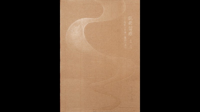
Feuilles
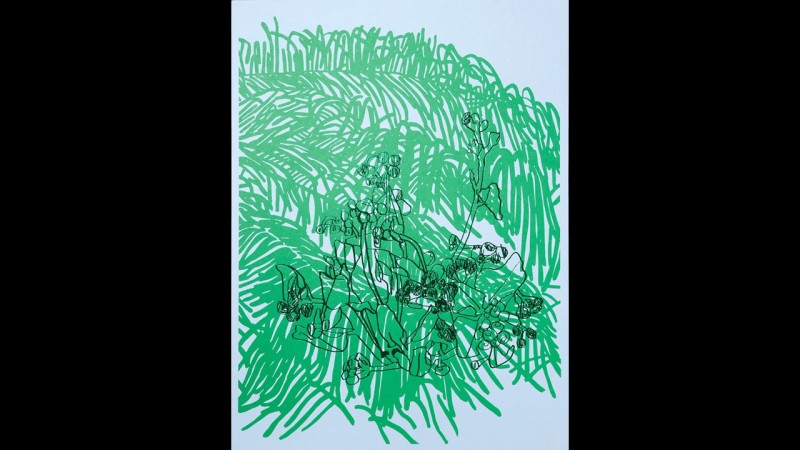
Feuilles, meaning “leaves” in French, is a collection of 112 plant illustrations by artist Eom Yoojung. Each Illustration is presented on carefully selected paper that best complements its form, method, and medium. Gossamer paper is used to create a see-through effect for a series of mainly monochromatic drawings, while thicker paper is matched with dry-feeling gouache illustrations to show the paint’s slight permeation of the paper. The cover, the typography on the inside of the book, and the binding thread are a matching shade of green. The jury for the Best Book Design from All Over the World award called it a special book that “plays very subtly with the connection between materiality and content. Opening with pencil drawings on gossamer paper that constantly transforms as you turn the pages: the illustrations increase in (line) weight, the paper in thickness. Carfully selected materials take the viewer on haptic journey through Eom Yoojung’s art”.
IN THE SPOTLIGHT: Arirang Perfomance Group
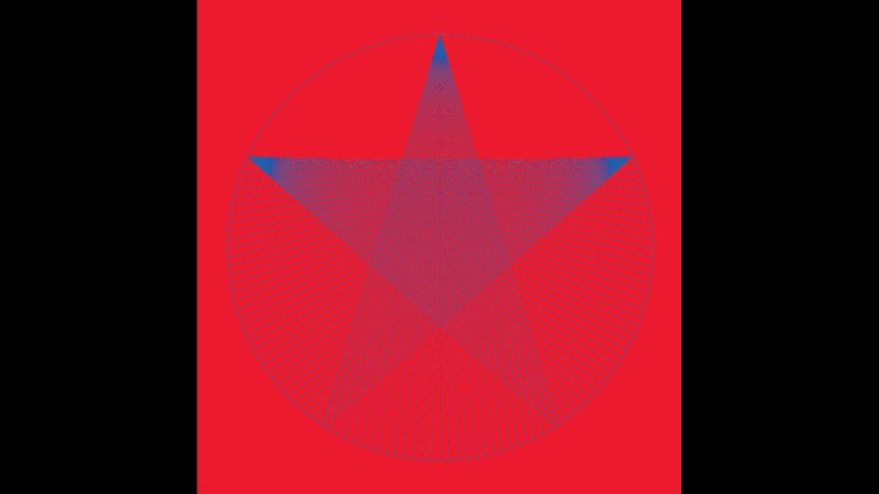
In the Spotlight: Arirang Performance Group is a book of documentary photographs by Lee Dongkeun, who mainly photographs those on the periphery of society. The book is a seven-year record of Arirang Performance Group, a performance troupe made up of North Korean defectors who preserve the culture of their homeland in music and dance. The photographs are a straightforward record of the lives of the performers, who jump between the kitsch realism of their shows, presenting North Korean music and dance to audiences using gaudy costumes and props, and their ordinary lives, existing on the fringes of society as part of the diaspora resulting from the nation’s division but still not accepted as “Korean.” The main theme running through the editing and design of this book is “crossing.” The ambiguity of the division between the front and the back of the book hints at concepts of north and south and crossing between the two. In attempting to understand what systems and ideologies the star on the cover symbolizes, readers are led to imagine what others might think. The book repeatedly juxtaposes flashy photographs of the troupe with images of the desolate Tumen River or the Sino-North Korean border. It is also notable that publication information only appears one-third of the way into the book. In the Spotlight: Arirang Performance Group reinterprets North Korea in polished images and uses its distinct cross-cutting concept to convey the lives and ordeals of North Korean defectors.
thisisneverthisisneverthat
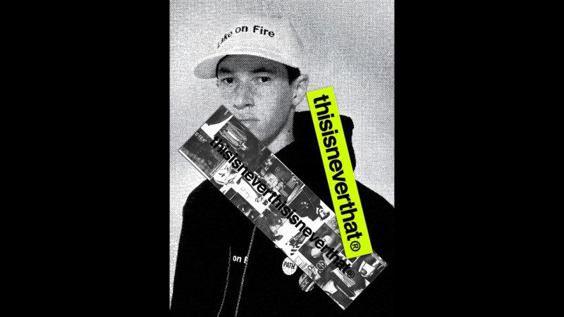
The name of fashion brand thisisneverthat, launched in Seoul in 2010, represents the brand’s design philosophy. It releases seasonal collections that mesh 90s culture with today’s trends, and collaborates actively with various brands and musicians. Big and small events marked thisisneverthat’s first 10 years, during which the brand gained countless followers and came to be regarded as a phenomenon in the Korean fashion industry. The book thisisneverthisisneverthat is a summary of the brand’s past decade as well as the product of its collaboration with Workroom Press, a graphic design studio and publisher. The project took one year to complete, culminating in the rare achievement of archiving 10 years of materials in 1,000 pages as well as on a website. The book’s design is powerful, brusque, and honest. Engaging writing and interviews add rhythm to its structure, which might have otherwise become monotonous. Another clever design feature is the Google Earth satellite photo of thisisneverthat’s location at the end of the book. The colorful irregularity of the book’s pictures, all taken for different purposes over the past 10 years, makes for an offbeat rhythm that is beautiful to observe.
New Normal
The art brochure New Normal is a record of the eponymous exhibition held at the Old House from February 28 to March 27, 2020. Showing alternative families that fall outside of the category of “normality” as defined by Korean society, the exhibition asked what “abnormal” relationships are like and whether they must be explained—perhaps such relationships are already present in our lives, functioning quietly. The book’s sturdiness is evident at a glance. Perfectly symmetrical without a single skewed line, the synthetic leather cover is curiously satisfying to touch, featuring crystal-clear gold lines. The text is printed in Buri and Serif typefaces and the pages feature varying center and image layouts. The book makes a remarkable effort to summarize countless ideas that befit an investigation into alternatives to the “normal” family model.
The Essential George Orwell
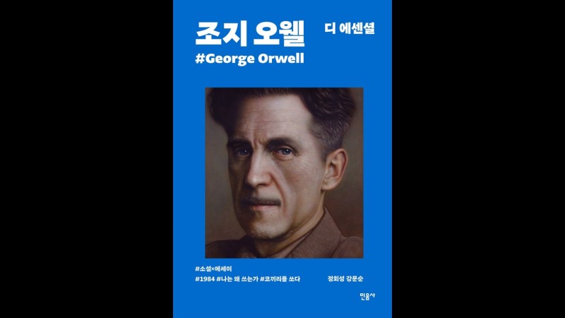
The Essential George Orwell, the first of a series designed by Minumsa and Kyobo Book Centre, was curated to define writer George Orwell’s traits in a single sentence. Designer Hwang Ilseon collaborated with artist Jeong Joongwon to complete a modern representation of the classic literary figure through illustrations instead of photographs. This choice plays a major role in visually expressing Orwell’s distinct character as a writer. The hyperrealistic portraits fully serve their purpose of honestly illustrating Orwell’s myriad stories and naturally expressing his truthful and sincere approach to writing without exaggerating his image. Beauty, being an abstract quality, can never be judged by certain standards of value and meaning. Nevertheless, what stands out about this book is that, in line with the changing times, its cover, design, content, font, and use of typography reflect a diverse mix of history and its contemporary reinterpretations, and of traditions and new endeavors.
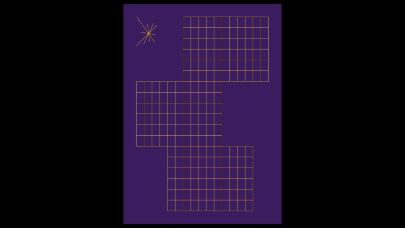
Mieum
Taking cues from Yi Sang’s poem “Au Magasin de Nouveates,” Mieum (ㅁ) is a complex, multidisciplinary publication that compiles work by figures in the fields of architecture, music, art, mathematics, geometry, literature, language, and film in various languages (such as French, Japanese, and Chinese, plus Korean and English translations) and formats (such as blueprints and scores). Its unique editing and design strategy is evident in the “main book” in which texts have been compiled in their original languages and the small, translated book that includes interpretations of the texts by designers. The main book retains the original graphics and text as much as possible, allowing Mieum to strike a fine balance between designs that have been processed by contemporary designers and those that highlight the original version, which work together to engage readers. The colorless and plain binding and table of contents neatly organize the complicated structure of the book into one concise object.
Grid Eraser
Grid Eraser is the first collection of poetry by Kim Nuiyeon and the first publication by Oemil. The book is composed of three parts and 71 poems, with 10 poems in Part 1, 59 poems in Part 2, and one poem each in Part 3 and on the cover. Part 1 focuses on word selection, text layout, and the sound of speech; Part 2 arranges and combines words to create new forms and meanings that reflect each other; and Part 3 gives a glimpse into Kim’s next book. The title of the book is composed of words taken from the poet’s work and repeats the word “grid eraser.” Grid Eraser stands as an impeccably well-made book even without the jury’s equal praise for all aspects of it. Words link to words in this series, clearly demonstrating the publisher’s intention and the designer’s execution. The font is particularly notable in its role in ensuring that Kim’s diverse styles do not clash, but complement each other.
Poetry and Strolling, Strolling and Romance, Love and Alcohol
Poetry and Strolling, Strolling and Romance, and Love and Alcohol are the sixth, fifth, and fourth books of the Flow of Words series. Round instead of sharp, cute rather than tacky and dramatic, Love and Alcohol is queer writer Kim Gwenzhir’s first collection of essays on relationships and alcohol. Eugene Mok’s Strolling and Romance is a quiet essay about her life. Poetry and Strolling is a neat collection of essays about the time that author Han Jeongwon has spent on reading poetry, talking walks, and pondering the meaning of life. The Flow of Words series takes a popular word chain game as its motif and attempts to rekindle the public’s waning interest in literature by linking people to people, words to words, hearts to hearts, and stories to stories. The covers make a clear and pretty impression, with the front and the back each featuring single word with bright colors filling in the space between the letters.
The Journey of Arita
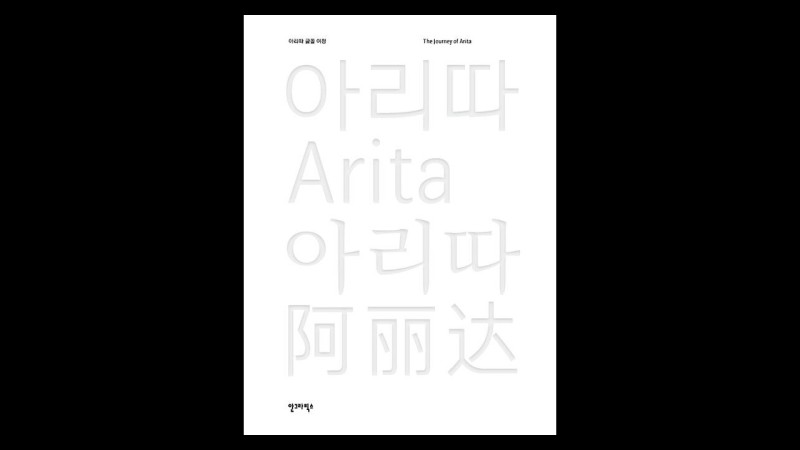
We encounter fonts everywhere—on road signs, books at bookstores, and even the phone that never leaves our hands. The Journey of Arita tells the story of the 15 font designers who created the corporate typeface Arita for the Korean cosmetic company Amore Pacific—an endeavor that took 16 years. From interviews with the designers to information about the process of making a typeface, archival photos, and records of books and products that use Arita, The Journey of Arita compiles everything related to the font. The table of contents and alphabetical list of keywords, with printed hyperlinks to connect relevant information to each keyword, reflect the book’s aim. Additionally, the use of large pictures, empty space, and color demonstrates the book designer’s intent to comprehensively explain the technical side of fonts. The book is meaningful in that it uses fonts to record the social welfare project of a Korean company and the achievements and efforts of the numerous designers who were involved over the 16 long years it took to create Arita.
Revolution Note
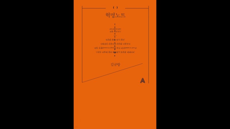
With keen insight, Kim Kyuhang, author of Revolution Note, analyzes politics, the economy, society, culture, art, education, people, and social affairs to talk about the fundamental social system that doesn’t just support individual hierarchical revolutions, but also promotes solidarity among individuals. Based on the idea that the seemingly endless condition of the “unforeseeable world” we live in is not a temporary blight upon capitalism but an expression of its true nature, the writer bitingly asks fundamental questions that readers might have previously ignored, rejected, or even forgotten about. The book refuses to follow typical design conventions. Its editing and design work closely together to support the content of the book. The 119 short but sharp pieces of writing feature footnotes that are formatted identically with the main text, an act that overturns the hierarchy typically expected of texts and changes the rhythm of reading. The unique composition of the book matches its title. Revolution Note is remarkable in its size, paper, and binding as well as in its address of diverse issues regarding editing and content analysis.
Das Jahr 1990 freilegen
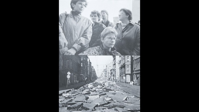
1990 feels like a blind spot in the memory of many. Das Jahr 1990 freilegen deals with various events of that year and their relevance today. The book is a montage of stories and essayistic observations that blend pictures and voices from 1990 and reflect on the year from today’s perspective. Some may not be familiar with the concept of a “coffee-table book.” But with or without coffee, Das Jahr 1990 freilegen belongs on every table. Composed of a well-structured collage of the little-known incidents that Germany faced in 1990, it presents new perspectives on every page, amounting to an enormous volume of information. The book’s diverse and carefully selected formats effectively symbolize its subject and create a rich archive.
Conrad McRae Youth League Tournament
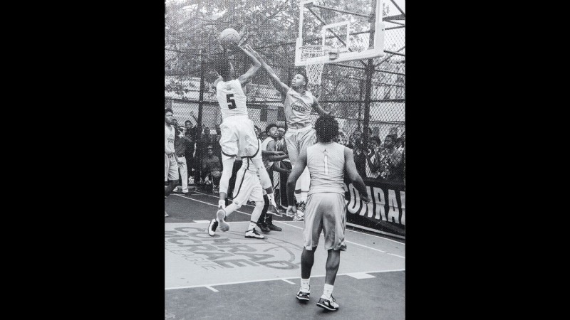
Conrad McRae Youth League Tournament compiles photographs, taken by Ari Marcopoulos from 2014 to 2019, of the Conrad McRae Youth League Summer Tournament held at Dean Street Playground in Brooklyn, New York. The tournament was established in the summer of 2000 in memory of Conrad Bastien McRae (1971–2000), a talented basketball player who had built his career in France, Italy, Greece, and Turkey and died that year during a training session for the Orlando Magic summer league in Irvine, California. Tournament founders Anton Marchand, Cleon “Silk” Hyde, and Troy Lemond remember their childhood friend every summer through the event. Open to basketball players over the age of six, the tournament brings in the best student players in New York. With very little text, the book chooses to tell its story through photos. The players’ stories, neighborhoods, and communities are impeccably edited and have been published on carefully selected paper. Turning the pages is like listening to the woosh of a basketball soaring through the air.
Memory Searching of Dances in Talks
Memory Searching of Dances in Talks—The Oral History of Intangible Cultural Heritage Dances in Shandong Province takes readers through a performance-like introduction to Chinese traditional dance. Colorful threads weave through the open spine while the use of different types of paper creates an interesting rhythm. The book even incorporates crepe, a material used in many dance costumes, and seemingly exudes the joy of life.
Electric Generator
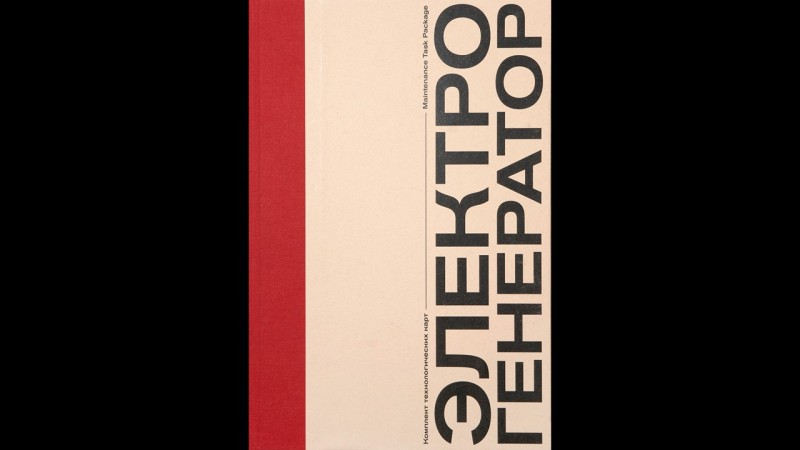
Although Electric Generator might look like an avant-garde Russian magazine, it is actually a meticulously designed operating manual for the titular appliance. In terms of both graphics and typography, this book employs various unassuming, clear, and neat methods. Even for those uninterested in the structure of a generator, Electric Generator is a surprising and engaging work that invites readers to discover the harmony between technology and graphics.
Suvila. Puhkamine Ja Arhitektuur Eestis 20. Sajandil
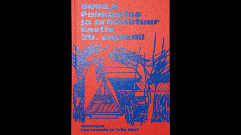
Suvila. Puhkamine ja arhitektuur Eestis 20. sajandil is the first book to deal with Estonian holidays and the rich heritage of 20th-century Estonian summer homes. It focuses on wide-spread Soviet-era architecture in such examples as private summer cottages and campsites popular with vacationers. Contributor Mart Kalm introduces pre-WW2 leisure architecture, Epp Lankots explores the diverse types of state-run vacation complexes, Triin Ojari focuses on major examples of private summer cottages, and Tiina Tammet explores the holiday landscape and gardens of the Soviet era. This book probes into the meaning of leisure and holidays in Estonia’s post-Soviet society; the line between workspaces and private space; regulations and self-determination; and how material greed and material well-being are interlinked. For many readers, this book will bring back memories of their childhood summer holidays. The book itself, disinterested in current design trends, is a testimony to 20th-century Estonian holiday homes. From the typeface to the paper, it invites readers to explore and be awed.
Marianne Hurum: Krabbe
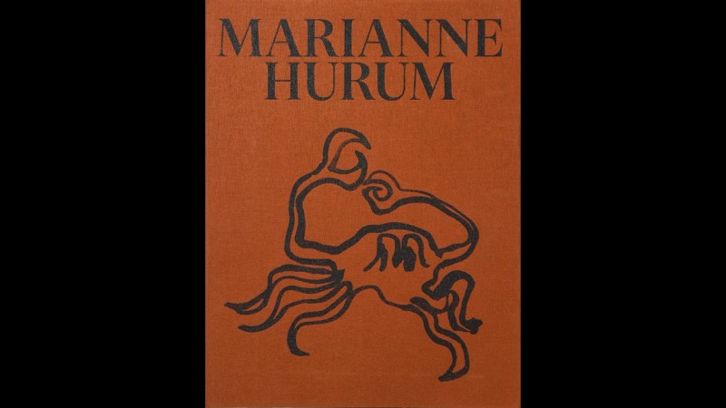
Marianne Hurum: Krabbe is a selection of photographs and sculptures by Marianne Hurum from 2016 to the present. In recent years, Hurum’s works have had a major impact on the development of Norwegian painting. Designed by Levi Bergqvis and Carl Gürgens, this book includes two new essays that contextualize Hurum’s works by young art historians Ellef Prestsæter and Maria Horvei. An enticing art catalogue printed by the famous Göteborgstryckeriet and published by the Lillehammer Art Museum with a strict approach to design, the book uses an interesting mixture of paper to convey the meaning of the featured artworks. The text is printed on colored pages and the chapters are marked by abstract symbols taken from Hurum’s works. Thanks to these design elements, readers can experience Hurum’s artworks without having to go to the museum.
Corinne
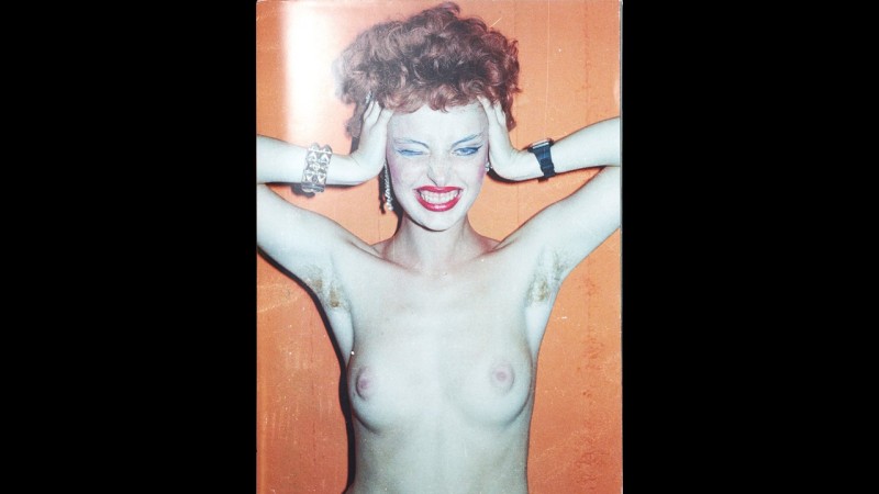
Corinne compiles some 80 pictures taken by Bruno Stettler in Zurich in the 1980s. Its pages appear unfinished, with no binding or stapling, as if inviting readers to recompose them. The composition of the photographs, on the other hand, is fully convincing. On glossy paper that mimics cheap digital printwork, the photos are granted a kind of vibrancy that reflects their artistry. Stettler writes, “You were my muse. You introduced me to the world of pop and rock music. You brought me backstage after live concerts. You were my groupie. You introduced me to drugs. You were never afraid. Your self-concept was shaped by fashion and punk. You were my girlfriend, my first love and nude model. You made me feel like a real photographer. You got me hooked on the wild lifestyle of the 80s. You often touched my heart. You shaped and enriched my life with your beauty, your humor and your love. I thank you infinitely.”
Data Centers. Edges of a Wired Nation
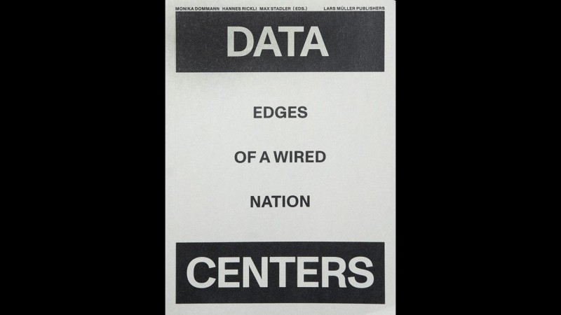
Questions regarding privacy, national borders, and statehood are constantly on our minds. Data Centers. Edges of a Wired Nation dives into Swiss data centers that gained importance during the COVID-19 pandemic. It presents essays and photographic records on diverse issues that affect us, including those of privacy, national borders, statehood, contagious diseases, and the relationship between energy consumption and climate change. Taking Switzerland as an example, the book deals with the country’s data centers, law firms, private companies, and government organizations that are involved in the development, management, and regulation of digital infrastructure. In this endeavor, it exposes diverse and sometimes contradictory stories that lie on the other side of Switzerland’s well-known mild climate, political stability, and relatively clean energy. The strength of this book lies in its clarity. The text is printed in binary black and white, and the typography gives readers an attractive and technical impression. This is also conveyed in the book’s block-shaped infographics that resemble server cabinets used at data centers.
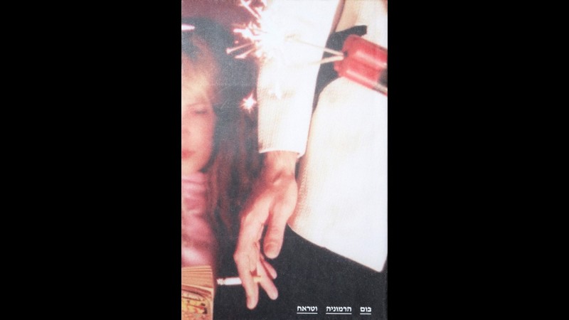
Boom, Harmony & Crash: The life and work of Charlie Megira
Questions regarding privacy, national borders, and statehood are constantly on our minds. Data Centers. Edges of a Wired Nation dives into Swiss data centers that gained importance during the COVID-19 pandemic. It presents essays and photographic records on diverse issues that affect us, including those of privacy, national borders, statehood, contagious diseases, and the relationship between energy consumption and climate change. Taking Switzerland as an example, the book deals with the country’s data centers, law firms, private companies, and government organizations that are involved in the development, management, and regulation of digital infrastructure. In this endeavor, it exposes diverse and sometimes contradictory stories that lie on the other side of Switzerland’s well-known mild climate, political stability, and relatively clean energy. The strength of this book lies in its clarity. The text is printed in binary black and white, and the typography gives readers an attractive and technical impression. This is also conveyed in the book’s block-shaped infographics that resemble server cabinets used at data centers.
Demonstrationsräume
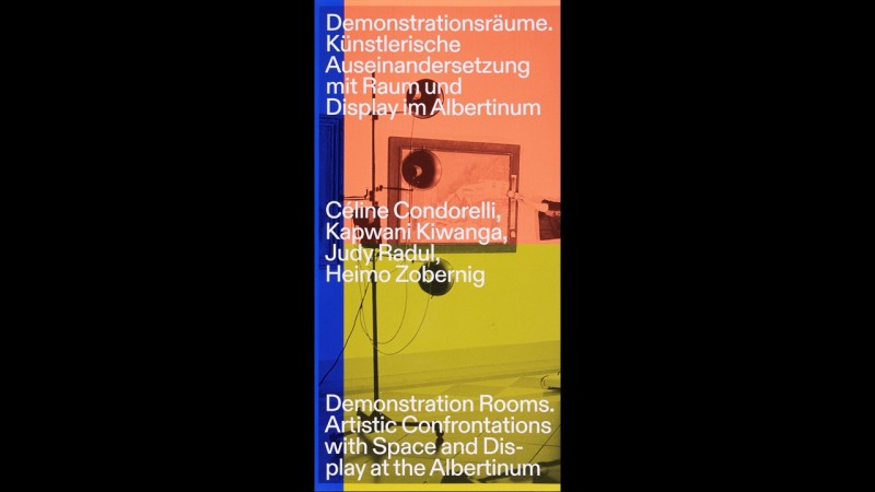
Demonstrationsräume. Künstlerische Auseinandersetzung mit Raum und Display im Albertinum is a book about a unique space created at a 1926 state art exhibition in Dresden by El Lissitzky (1890–1941). A Russian constructivist, Lissitzsky worked across the genres of painting, graphic design, architecture, typography, and photography. The space he created expressed the concept that space and audience are components of an artwork and that art can be made more accessible through spatial organization. The book’s question lies in how space, audience, and time change the character of an artwork. The title of the book quotes one of the terms that the artist used in his design, “demonstration rooms.” His experimentation with space and context is carried on by the layout of the book, which is long and thin in shape and features a division in the middle, resulting in a startling visual effect.
The Remarkable Rocket, Oskar Wilde
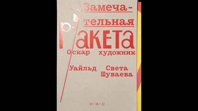
The narration of The Remarkable Rocket was written by famous author Oscar Wilde. The cover, which is made of thick cardboard and imitates firecrackers with its colorful sheen, encases a story vividly told through the creative use of illustration and typography. The characters are neither people nor animals, but a large Roman candle, a fire fountain, a small firecracker, a Bengal light, a small fireball, and a cool rocket. These fireworks, as characters, have different personalities, styles of speech, goals, desires and opinions of the human world. Designed by Russian contemporary artists for V-A-C Press’s fairytale series, this book displays traditional Soviet illustrations.
Revelo No. 1. Chroniques de chantier. Transformation de la Gare, CH-1800 Vevey
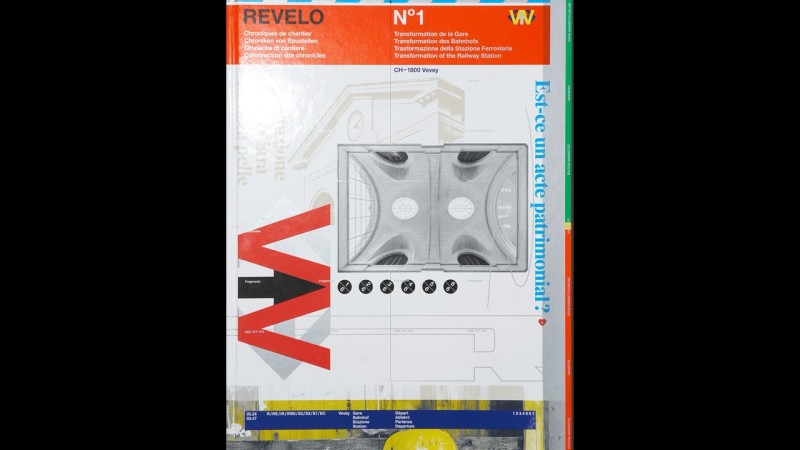
Transformation de la Gare, CH-1800 Vevey, a large but light book, features many bold colors. It is divided into six parts, which are folded, cut open, and bound into a book that is half the paper’s original size. The book presents the station’s architectural, structural, technical, cultural, and historical context. Picture essays, a list of related companies, and extensive publication information combined with the design identity of Schweizerische Bundesbahnen (SBB) create diverse visual languages on the book’s thin coated paper. Considering the large range of potential readers, the book is extremely experimental and daring in its editing, information design, and typography. Taking a detailed, unconventional approach to a subject that might not interest everyone, the book uses aesthetics that target the general public.
Aporia. The City is the City
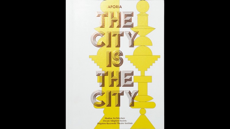
As part of the Aporia project, Aporia: The City Is the City clearly expresses two realities existing in one city. Cities contain chaos and order. It might seem impossible to organically link and connect a city under a single system. An architectural structure can simultaneously become a cemetery and a bazaar or a stadium. Slums and street stalls built of twisted iron lurk, growing like slime mold, in the shadows and on the sides of monumental, perfectly planned cuboid buildings. Architecture, streets, and even people are infinitely linked inside the space of this dual city. Shadow architecture is a utopic realization of an urban area that perpetually grows and hybridized. This book, composed like an exhibition catalogue, combines various craft elements. Its most important design feature is its poetic typography and illustrations that sharply contrast with old copper engravings. Readers can use a VR app to view superimposed 3D images on the pages as well.
Almanach Ecart. Une Archive Collective, 1969-2019
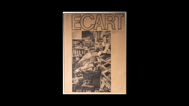
Almanach Ecart. Une archive collective 1969–2019 is a research publication about the archive of Ecart, a group of artists founded in Geneva in 1969, that presents intriguing materials in a highly structured conceptual order. Each page holds a datable facsimile document, such as a letter, postcard, invoice, or invitation, along with brief commentary. The documents are organized in chronological order, one for each day of the year, spanning a period of at least 10 years. Dates and page numbers are set in a fixed location on the pages, but the arrangement of different-sized documents has been executed more freely. These materials testify that in the era of Situationism and Fluxus, even administrative documents were used as artworks. This expansive archival presentation creates an informative record of the 1970s group. The use of a brown dust jacket made of wrapping paper, a grey cardboard binding, and a font used in past Ecart newsletters emphasizes the archival nature of the book.
Amsterdam Stuff
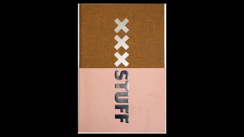
Amsterdam Stuff records the history of the city of Amsterdam through archeological relics excavated from a riverbed. It consists of 15,000 pictures of the excavation by Harold Strak that demonstrate the photographer’s eye for detail, color, and the texture of each relic. The book can be read in various ways. Providing a stream-of-consciousness commentary on objects and the world as we perceive them, the book encourages readers to explore and reorganize the relationships between objects and people’s lives. Willem van Zoetendaal’s clear and enticing design reflects the systematic structure of a catalogue and reveals stories of the archaeological events one by one. The physical relics of a city are living organisms. This book uses photos to present, both functionally and chronologically, the stories and roles that these organisms assumed in the city.
Heimat, Handwerk, und die Utopie des Alltäglichen
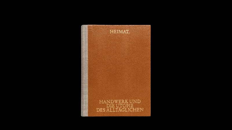
The hard, fake leather cover, coarse linen-wrapped spine, small size, and unexpected title placement at the top and bottom corners of the cover (in gold embossed letters) give Heimat, Handwerk, und die Utopie des Alltäglichen a striking effect. Dealing with the concept of “homeland” in the architecture and landscape design of the first half of the 20th century, this book is composed of critical essays accompanied by historical texts and pictures. Its meticulous appearance makes the reader curious about whether the book is critical of its subject. The main text is printed within wide, fancy gutters. The solemn mood of the book is offset by large indents at the beginning of the paragraphs and captions, which, printed in silver, extend across the width of the top edge. The placement of pictures to the left of the columns and page numbers only on the right side result in a depth of the space in the main text and on the left pages, respectively; centered headlines create additional stark contrast. These elements of typographic irony do not dilute the serious analysis of the book, but rather emphasize the critical distance—a subtle achievement of the publication.
Ornithology
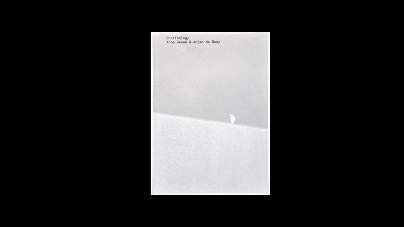
Ornithology is the branch of science dedicated to the study of birds—their physiology, classification, ecology, and behavior. Birds’ eye-catching and colorful appearance make them a popular subject in science, visual art, and photography in particular. Hunter-gatherers Anne Geene and Arjan de Nooy efface interdisciplinary borders with a pseudo-scientific approach. Their classification of photographs of birds invites readers into all fields in ornithology with new perspectives and humorously creative and associative thinking. The index of Ornithology is stylized to serve as a reference material. However, its scientific appearance to artistically mimic its counterpart in real scientific practice. The diverse motifs used in the book are structuralized as variants and interlinked through specific relations with each other. The designer’s rich imagination, both startling and fascinating, is both self-explanatory and surprising to readers in its presentation of a completely new consistency in academic publishing. This book is a rare example in the world of bird photography, which is dominated by people who cherish classic aesthetics.
Other Evidence: Blindfold
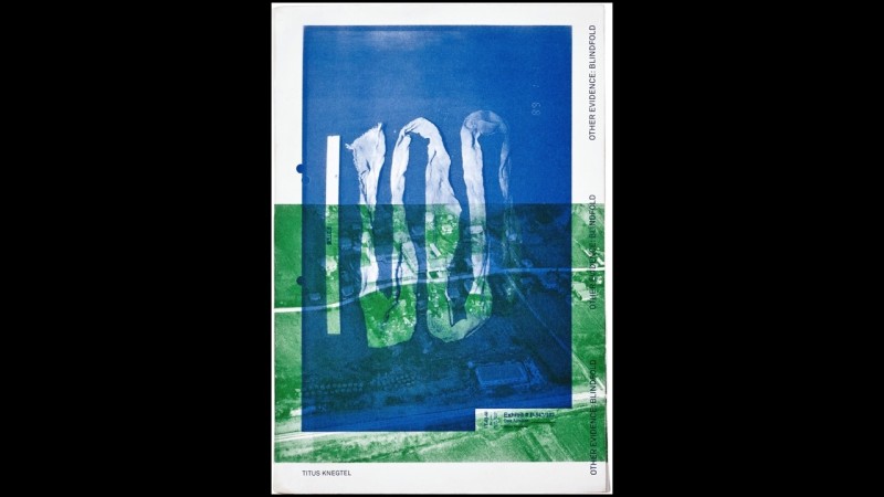
A traumatic event does not simply fade when it is forgotten. If it exists in one’s memory, one cannot go back to normal. Other Evidence: Blindfold records the Srebrenica massacre of 1995, during which more than 8,000 lives were lost. The book uncovers materials and evidence of the crime possessed by the International Criminal Court and translates the 50,000 pages of autopsy reports and 30,000 pieces of photographed evidence into an objective presentation. As an artist’s book, Other Evidence is like a monument, helping us achieve something by capturing things that we cannot understand due to visual or material obstacles. This book does not play with tropes or try to impress readers with the typography. It will be valued and kept as an expression of shell-shocked shame. When people pick up the book from time to time, they will ask themselves: “How could this have happened?”
Untitled (September Magazine)

Designed by Paul Elliman, Untitled (September Magazine) is composed of 600 pages of images from various sources, such as fashion magazines, glamor photographs, and pornography, cut and arranged in a way that emphasizes the beauty of the body in segments. The images feature a spectrum of clothed, semi-naked, and nude subjects and focuses on hands, arms, legs, feet, torsos, and more private body parts. Turning the pages of this book, devoid of any text or commentary, is like meditating on the human body and falling deeper into iconographic exhibitionism—the use of reflective glossy paper serves only to enhance this charismatic expression. The cover consists only of a close-up of a person’s forehead and a barcode. Similarly, there is nothing on the back cover but rippling Yves Klein blue. Inside, the book catches shots of beautiful bare feet, Prince of Wales check pleats, pointing gestures, and hands holding objects. It would be too simple to call this book an artistic parody because it penetrates the visual code in which we are trapped and reframes our desires as despair.
Meret Oppenheim. Worte nicht in giftige Buchstaben einwickeln
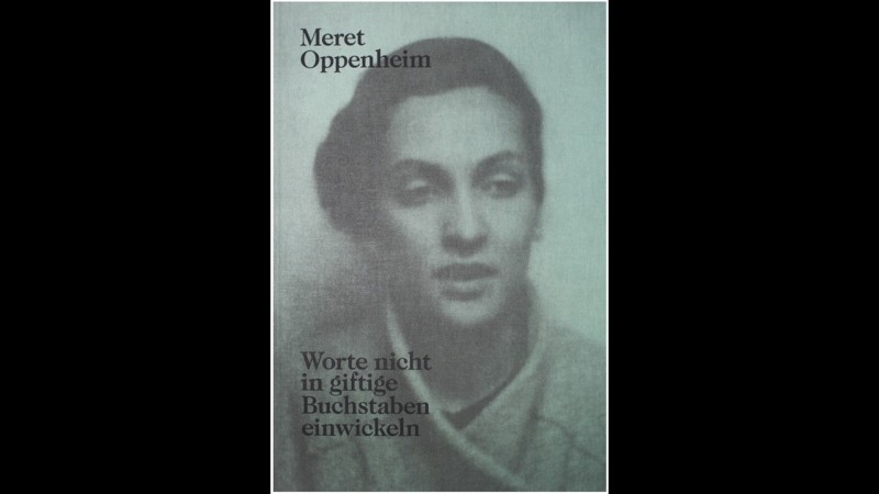
This weighty book of extensive materials deals with the works of Meret Oppenheim, one of the most famous European artists of the 20th century. In 92 pages, Meret Oppenheim. Worte nicht in giftige Buchstaben einwickeln reproduces more than 1,000 documents that have not been published for 70 years, plus a collage of pictures and a handwritten autobiography by the artist at 45. Including letters to her mother, father, and husband as well as to artists Max Ernst, Marcel Duchamp, and Leonor Fini; intellects André Breton and André Pieyre de Mandiargues; and curators Franz Meyer, Bice Curiger, and Jean-Christophe Ammann, the never-before-published documents provide an intimate insight into Oppenheim’s life and work. In terms of design, the book’s remarkable use of large, broken text encourages readers to engage. Although the large typeface does not use wide spacing, the bold and slim letters give the double column design some room to breathe. Footnotes are placed unconventionally in the narrow space between the columns in single or double rows and printed in dark grey. The overall look is solemn and systematically structured. Meret Oppenheim demonstrates a clever use of diverse pastel colors for the album pages in the facsimile section on various types of paper.
Fallen
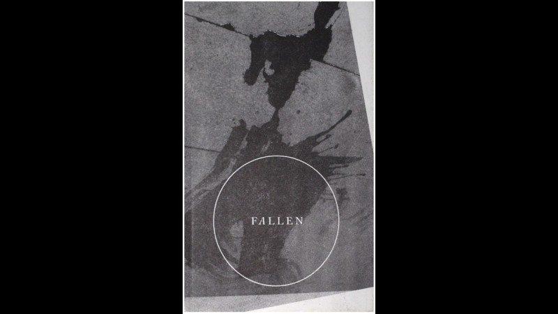
Fallen is published in two versions, German and English, by two writers working with the same motif. While the title is in present tense in German, it is a past participle in English. This mirrors the book designer’s typographic motif. Throughout the book, the text is occasionally rotated 180 degrees, and sometimes left- or right-justified to indicate a day’s order. Reading from left to right, readers will find themselves turning the book in all directions as they flip through the pages, perhaps even losing their sense of direction while stumbling toward the end of the story. This dizzying carousel ride continues to another story, this time in the opposite direction. In this special design by Hans-Jörg Pochmann, no answers can be found in the text, which brings a sense of a zero-gravity experience. As the last page of one section continues to the first page of another and the words rotate even more, the pages become weightless.
La Residence
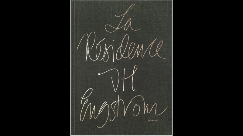
In La Résidence, J.H. Engström’s photographs lead us to what makes us the most insecure—loneliness—but instead of giving answers about the absurdity of the human condition, they present a profound experience. These photos are by no means easy to decipher. Unlike other photographs in which the photographer’s intentions are clear, viewing Engström’s photos is like learning a new language. Every moment of his work is powerful, seductive, and motivating. He strives to live more by waiting behind, being restless, questioning, and going in circles. His genius lies in the juxtaposition of his displacement, his restlessness in what is considered a normal environment, and the comfort and the familiarity of a boring life in a bar. The 29 pictures included in this book, accompanied by 29 diary entries, made Engström one of the most revered Swedish photographers today. The book is both simple and complex in structure. Sequences of three photos at a time create a complete scene through the book’s folded-page design. Each sequence begins with images on two pages that are not divided by a barrier to indicate a change of subject. Then, the book seeps into life, lyrically and descriptively, with a few lines of writing, a long riddle, or a photo of a gesture or people. Reading the book is not a dramatic experience. There is no profound lesson to be learnt. But each sequence, like a piece or a jigsaw puzzle, stirs readers’ curiosity and creates a fascinating interactive experience.
Atlas of the Conflict: Israel – Palestine
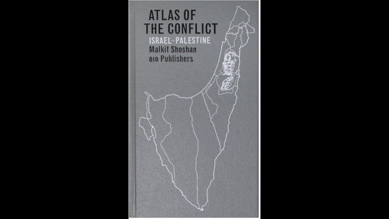
Atlas of the Conflict looks at the incredibly complex development of and mechanisms behind the Israel-Palestine conflict over the past 100 years. Using more than 500 maps and diagrams, the book provides a detailed territorial analysis of the conflict through various issues regarding territory, settlement, land ownership, archeology, cultural heritage, management of natural resources, landscape, war, and treaties. Taking the form of a dictionary providing diverse information, the book documents the conflict from multiple perspectives and provides insight not only into the unique situation of Israel and Palestine, but also into how the region is used as a political tool. The creative design of the book’s pocket-type format, insightful structure, detailed charts, extensive mapping, documentary photos, encyclopedic text, and printed hyperlinks make it the complex and sometimes confusing content structurally clear.


